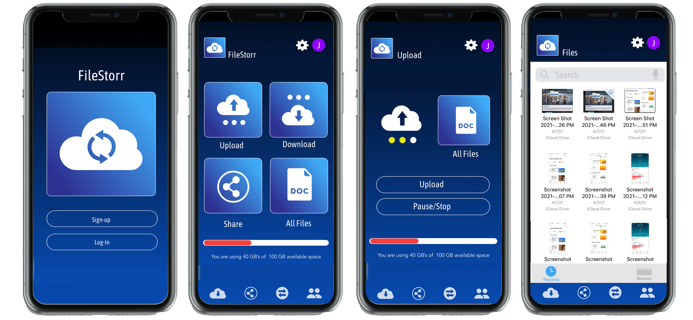
This app allows users across age demographics to quickly and effectively save their documents onto a cloud drive with the ability to access and share these files across platforms, on social media, and with family and friends.
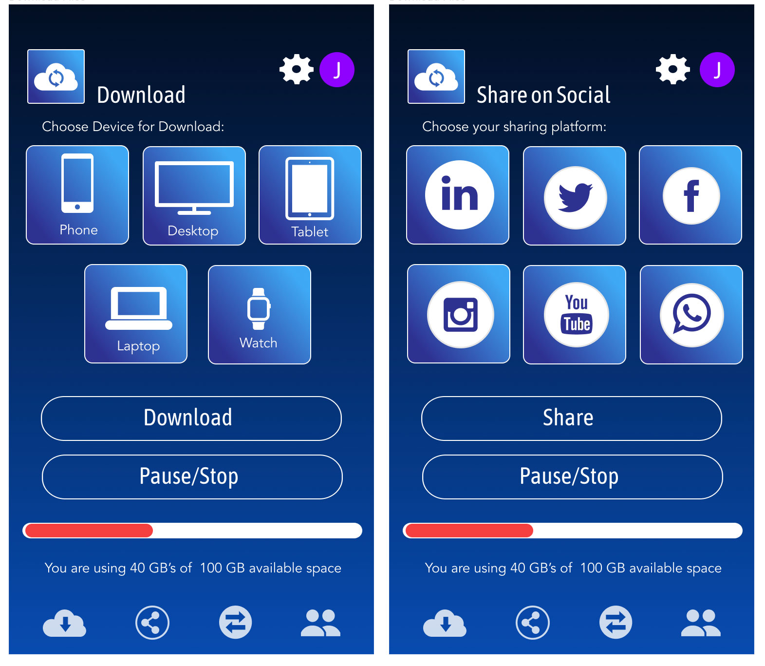
Users can share files stored within FileStorr's cloud-based servers on social media and communication platforms such as WhatsApp, Facebook Messenger, Telegram, SMS, etc. Users can share files via an individual web link.
A key aspect to this project is safety and security. A client needs to know, beyond a doubt their files a secure, backed-up and safe from hacking.
With file storage hackings becoming the norm, users are understandably worried about their personal files' security and safety. FileStorr will need to assure potential customers their files are safe from hacks and secure from being deleted. A filestorr client will be confident knowing their files are safely stored and readily accessible to download and share.
FileStorr needs to provide an effortless experience for users to upload and download files and easily share files with zero margins of error. FileStorr aims to allow users to download files across all their devices using their wifi network.
Today around seven-in-ten Americans use social media to connect, share information and entertain themselves. As more Americans have adopted social media, the social media user base has also grown more representative of the broader population. Young adults were among the earliest social media adopters and continue to use these sites at high levels, but older adults' usage has increased in recent years.
FileStorr needs to allow all users to share their files and documents on social media and across communication platforms such as WhatsApp, Facebook Messenger, Telegram, SMS, etc., easily and quickly.
Millennials have more than 67 apps installed over the phone. However, the number of commonly used apps remains just 25. With the increase in the age group, the number of apps installed decreases. Fascinating insights about app usage here: Simform - App Usage Statistics 2021 that’ll Surprise You
With the target group being millennials for the FileStorr app, the app should straightforward to use to be a top used app. However, being a filesharing app, older users who tend to be very active on Facebook should not be overlooked as potential clients.
In the future I'll be posting user personas here using Miro. User Personas Example
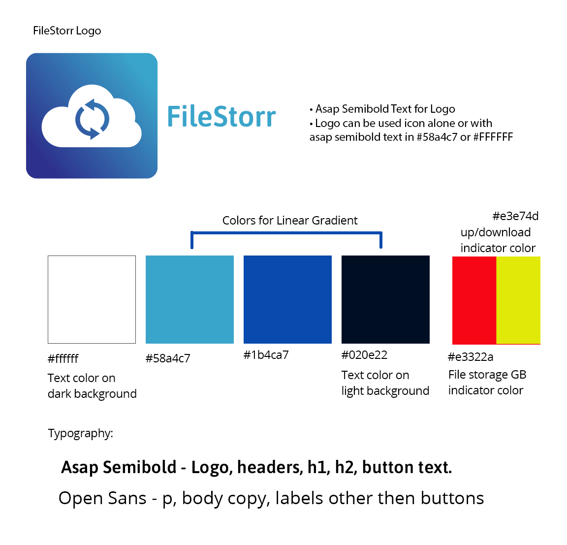
I choose the blue colors because blue gives a sense of innovation. Often, companies use blue because it is associated with tech and innovation. It makes people feel secure and makes the product seem trustworthy. More often than not, it’s a case of trying to convince the user that this is the right product to use. FileStorr is a technology brand. Brands like Dell, IBM, Intel, AT&T, and PayPal take advantage of blue’s trustworthy message; they create products that people rely on day after day.
I love gradients and feel by using them designers get more creative freedom. A gradient creates visual interest and helps users move through the design.
I also choose blue for assessability. The most common types of colorblindness (Protanopia and Deuteranopia) can see the color blue.
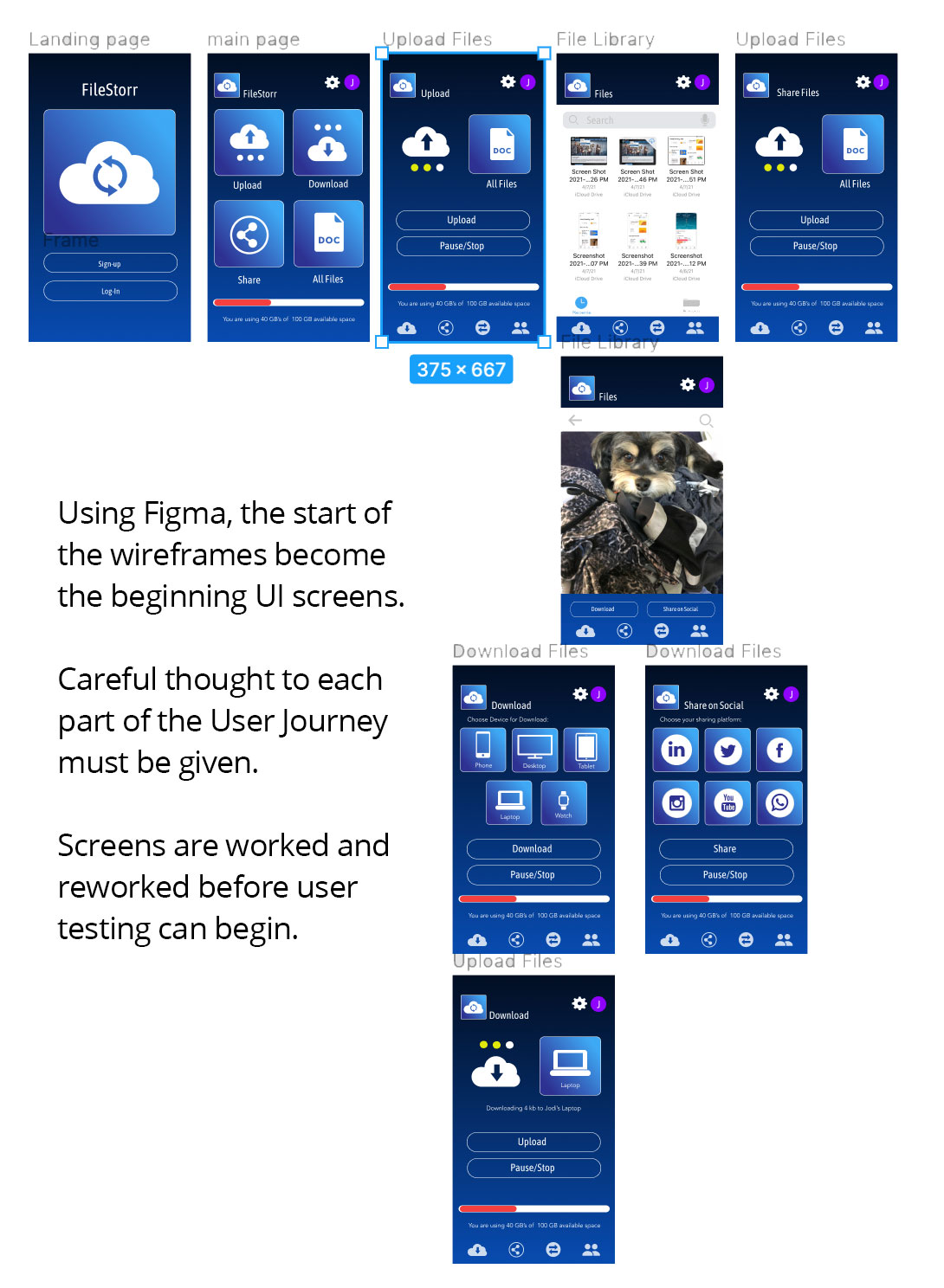
I wanted to keep the layout simple to minimize cognitive load. Cognitive load refers here to the amount of brainpower required to use the app. When an app provides too much information at once, it might overwhelm the user and make them abandon the task. It’s essential to get rid of anything in a mobile design that isn’t necessary because reducing clutter will improve comprehension.
I also wanted to keep the design consistent and familiar. Consistency is a fundamental principle of design. Consistency eliminates confusion. Maintaining an overall uniform appearance throughout an app is essential. Familiar screens such as “Gettings started,” “What’s new,” and “Search results” have become de facto standards for mobile apps. They don’t require additional explanation because users are already familiar with them. This allows users to use prior experience to interact with the app, with no learning curve.
I choose Asap because, "Asap is a contemporary sans-serif family with subtle rounded corners. This family, specially developed for screen and desktop use, offers a standarised character width on all styles, which means lines of text remain the same length. This useful feature allows users to change type styles on-the-go without reflowing a text body." Description is from Google Fonts
My app assumes the user is using an iPhone on ios. I used icons and functional elements (input fields, checkboxes, switches) with a native feel.
To have a perfectly customized and tailored mobile application, the most crucial step is to realize the user's needs and requirements.
This project demonstrates how much research goes into developing an app before building any screens. The best way to have an app that differentiates from others is to let your users guide you in what they want and how they want it. With that in mind, I plan to develop more fleshed-out user personas and journey maps to guide my design and user experience further.