The Michigan Grant Portal Redesign

The Michigan Council for Arts and Culture Affairs grant application portal redesign project.


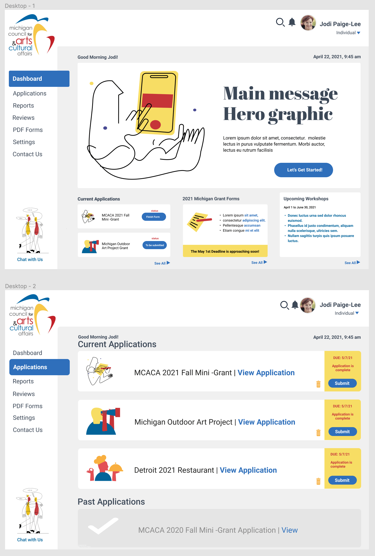
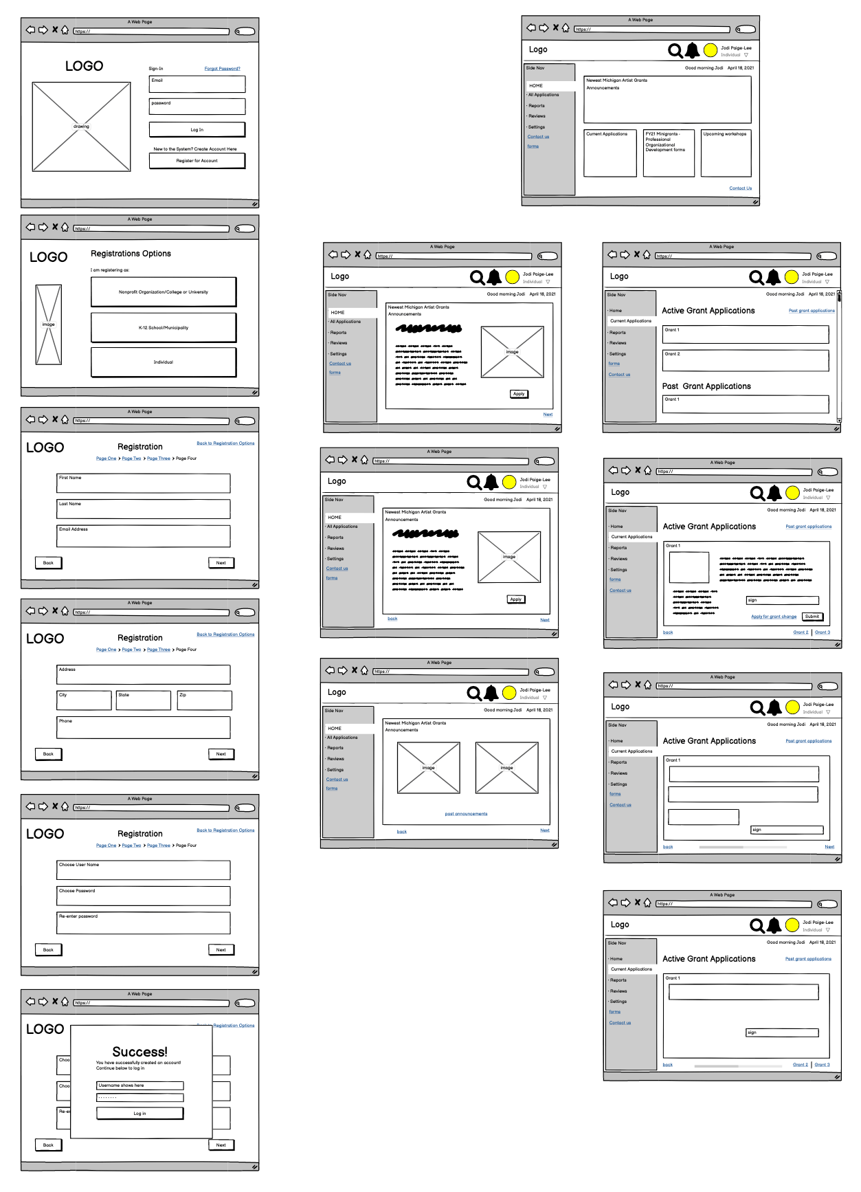
What is the project?

The Michigan Council for Arts and Cultural Affairs currently has users log in and apply for grants from a portal that is difficult at best. The site is confusing and not user intuitive. A confusing site is especially troubling as the majority of users are older and not tech-savvy. The MCFAACF has set up workshops to teach potential grant applicants how to go through this site. If you need a class to use a website, it's not working. The interface itself is dull and unappealing, with a lot of wasted space.

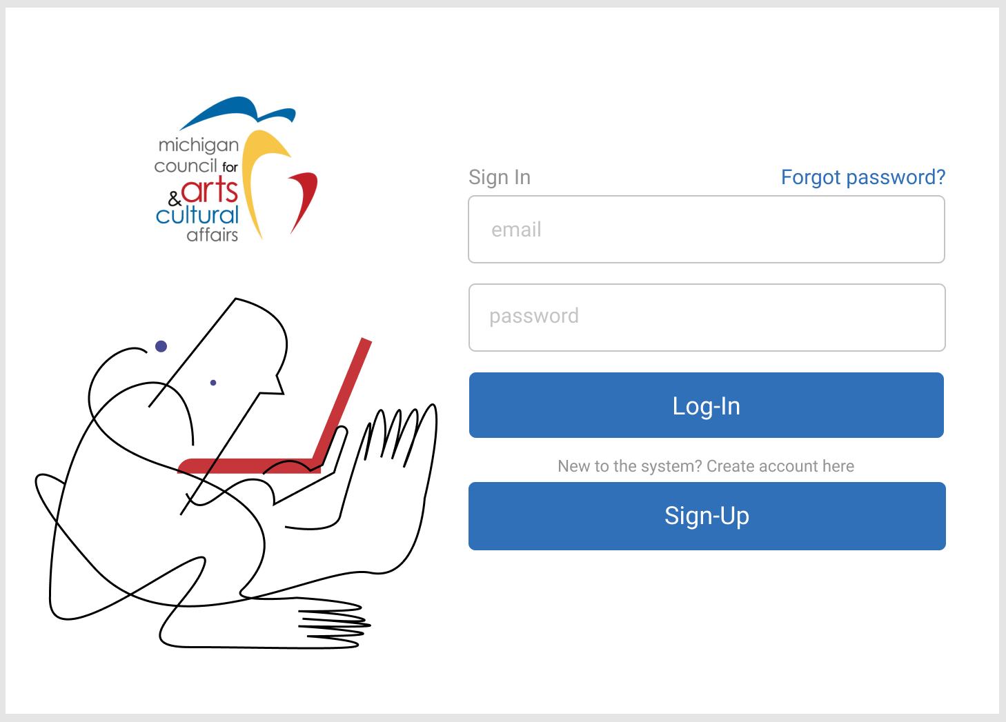
One of the more serious problems with the current website is its lack of accessibility, especially for users with low visibility. The portal login has some severe issues with contrast for people with low vision.

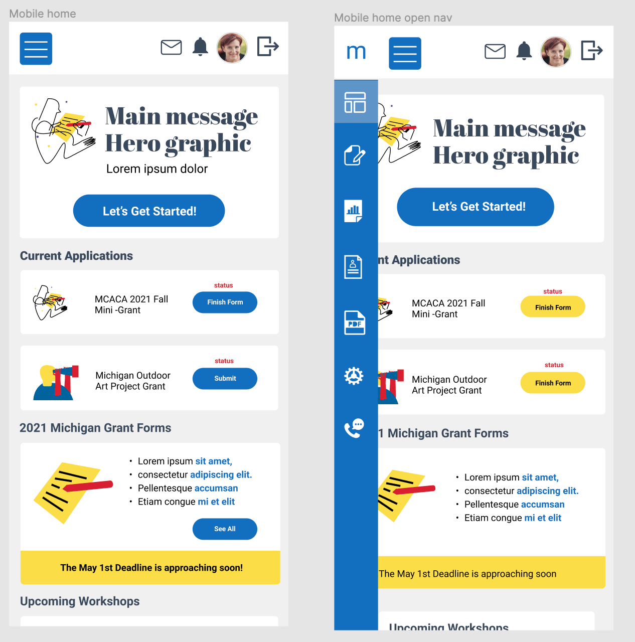
The login portal also has its explan ation to the right. While this is adequa te when viewed on a desktop or tablet, it presents problems when viewed on a mobile device as it defaults to under the login, hiding the directions.

This project aims to revamp the site visually and organize the information into easily understandable bits.

Tell me more about the project.

I spoke with several grant writers for this new project to understand their pain points when working on grant applications and uploading files. I then reviewed the information on the current website and made a prioritization list.

Deciding to develop a personal dashboard rather than a homepage for the MCAACA homepage made sense as the state of Michigan offers many grants with applications through different portals. A user currently applying for grants will have to navigate through a labyrinth of other websites and pages. The aim of a single entry point for all Michigan grants will alleviate the confusion caused by multiple portals and forms. A personal dashboard will track a user's progress through each grant application and keep track of a user's progress through the entire process. A user is kept organized on current grant applications with a single dashboard and notified when new grants become available. The MCAACA also has a single system to process, review, and award grants.

Who would benefit from this?

The redesign is for all grant seekers, grant writers, and awarding committee members who would rather spend time on their art struggling through a poorly organized and confusing website.

The majority of grant seekers using the MCAAAC portal when writing this are over 50, not as comfortable with technology, unfamiliar with standard UI patterns, and with some degree of visual disability, including age-related loss of vision. Applying for a grant involves many paperwork and forms, usually downloaded, filled out, and uploaded to the grant site. A frustrating site experience can lead to users not willing to apply for grants.

While all grant seekers and committee members will significantly benefit from a wholly reorganized and visually refreshed portal, users with visual difficulties will benefit the most as the new design will pay special attention to accessibility guidelines. The MCAAAC website and app must pass Section 508 accessibility compliance.

User testing and learning outcomes.

"I'm a grant writer for a nonprofit and seeing a redesign of a grant application portal would be so nice. Michigan's Council for Arts and Culture is not alone in this, I've seen so many grant portals that are confusing and could benefit from an easy to use home screen."

While user testing is still in progress and screens continue to be developed, initial feedback has been extremely positive! The new interface is a success, being well received with its clean white and illustrations. Comments include loving the "Miro style illustrious, perfect for an art portal" to "finally I can find what I'm looking for." The personal dashboard is also a huge success, with early tests showing users feel comfortable with it.